
Web design & concept · 2026
Web design for Schreinerei Fischer
Two weeks of work experience in a carpentry workshop — wood, windows, workbench. While working, the conversation turned to my hobbies, and it emerged that the business had no website at all. So I offered to design one.
- Brief
- Concept and design framework
- My role
- UI design, colour and form definition, wireframing
- Timeframe
- Two-week school internship, 2026
- Tools
- Paper and pencil, Figma
01
The brief
My internship at the workshop was a hands-on one: working wood, fitting windows, seeing how the business runs. Web design was nowhere in the job description.
The carpentry workshop in our town does genuinely impressive work — but online it was invisible, simply because it had no website. That came up while we were working, when we got talking about my hobbies. So I offered to design a modern look and a technical framework the workshop could later build its real site on.
So I had no commission and no specification, but a task I had set myself: build a clear, well-ordered structure that shows at a glance how much quality goes into their bespoke furniture, interior fittings and windows.
02
Colour, form and layout
First I thought about which colours, typefaces and layouts actually suit a traditional carpentry workshop, and then talked it through with the carpenter. It mattered to me that you feel the craft straight away: earthy browns and greens read as natural and grounded, and bring wood and forest to mind immediately. As a contrast I planned a warm orange-yellow — ideal for making important buttons and calls to action stand out.
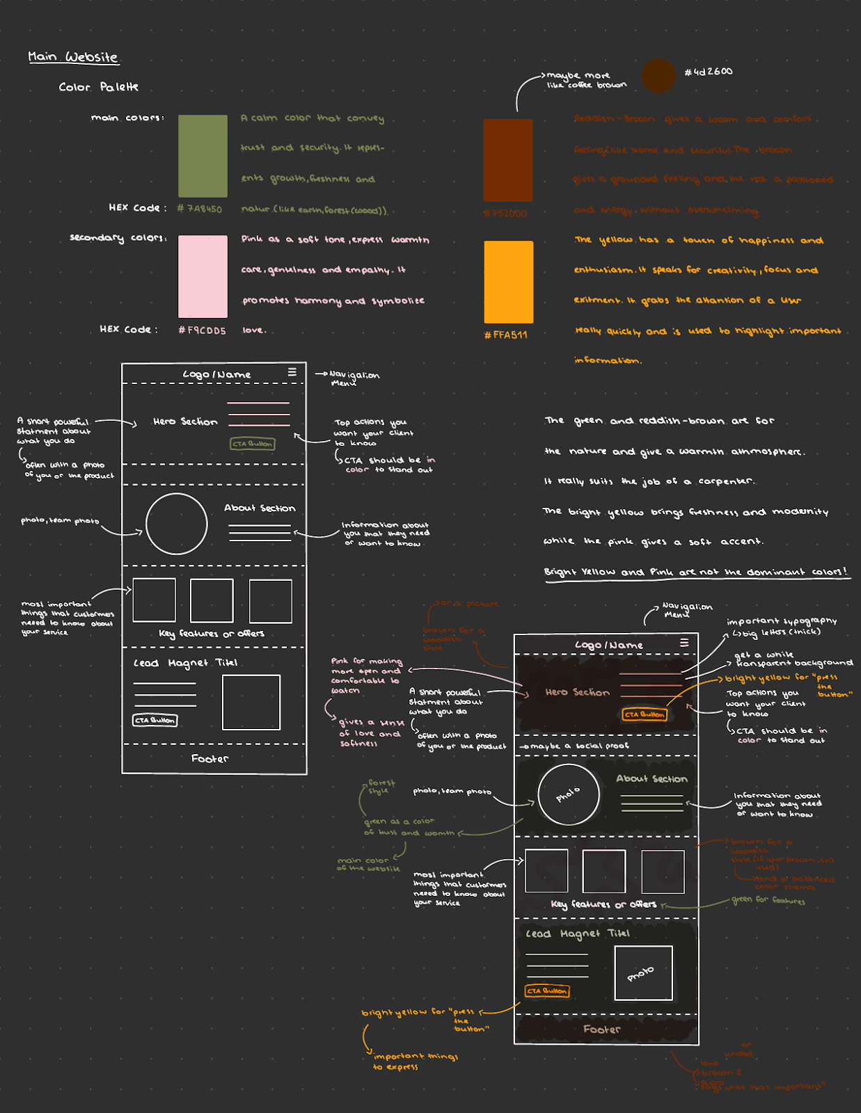
What I realised: a trade business needs no wild animations or gimmicks. What counts is clear navigation, contact details that are quick to find, and a tidy overview of the services.
03
The framework in Figma
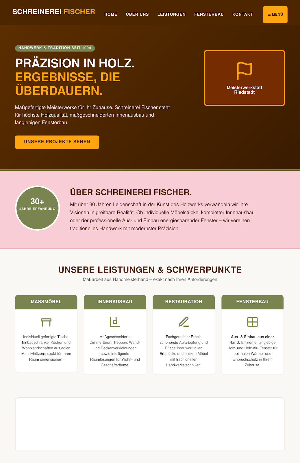
With the sketches and the carpenter’s feedback in hand, I moved on to the second step and built a digital framework in Figma. To show the business how the site would later feel to real customers, I laid out clear zones: a strong opening area with a direct statement, a short about section, and a tidy tile system for the main services.
It was important to me that the blocks for bespoke furniture, interior fittings, restoration and window building stay flexible. If the workshop later wants to add new reference photos or services, that should be easy.
04
Decisions
- Natural earth tones. Wood brown (#752000) and forest green (#7A8450) simply suit the material and read as warm and trustworthy at once.
- Bright accents for actions. The intense orange-yellow (#FFA511) is used deliberately only for the menu button and important calls to action, so the eye goes straight there.
- Clear tiles instead of walls of text. Most people search online for something specific, like “windows” or “bespoke furniture”. The tile system shows every service at a glance.
- Show the experience. Badges such as “30+ years of experience” or “master workshop” build trust immediately — exactly what people look for in a tradesperson.
05
The result
06
What I would do differently
Because I wanted to show first layouts quickly during the internship, I started out with the usual placeholder text. Talking to the carpenter, though, I realised that explanations in the trades are usually much shorter, more precise and more technical than in standard web layouts.
Next time I would ask for real project descriptions and customer questions during the sketching stage. Then I could size the text boxes and spacing to the actual content and save myself the later adjustments.